Showing posts with label 1970s. Show all posts

Sunday, 2 December 2012

Community announcement (from 1973)


The first thing that popped into my head when I found out that the theme for Sunday Stamps was "public service announcements" was this set of stamps that were issued in March 1973 to help educate the community during the transition from the imperial to the metric system.


The overweight strange-looking dude is a bit of a strange choice, but I guess the stamps get their message across.

I didn't really think that Australia issued many "public service announcement" stamps - but then, looking through my album I also spotted these stamps, which are from a 2008 issue entitled "living green".

Unfortunately my copies of the stamps are very far from mint... I clearly didn't do a very good job of soaking the gum off them.


It's a pity the stamps are so damaged, because the images are quite striking... I particularly like the walking bus. Save water; reduce waste; travel smart. Three very simple messages about living more sustainably and in an environmentally conscious manner.

That's it from me for this evening. Happy Sunday everybody, and follow the link below, should you wish to find out about more stamps with "a message"


Monday, 19 November 2012

Geology and gemstones: Sunday Stamps


The challenge this week on Viridian's Sunday Stamps was to share a stamp featuring something related to geology. I get pretty excited about rocks these days, so I thought this was quite a wonderful, broad topic. Australia has issued several stamps featuring Uluru (formerly Ayers Rock), which is arguably the country's most famous geological marvel. A sandstone monolith, that turns red at dawn and dusk, Uluru is magnificent.


However, given the scope and possibilities for the theme 'geology' I was hoping that I could come up with something a little bit more exciting than the standard Uluru stamps. (That said, there is nothing 'standard' about Uluru itself. It is an awe-inspiring and magical place, and it deserves its iconic status.)


Anyhow, it turns out we don't celebrate rocks (or geology) enough in our stamps issues. I wanted to find a cool stamp with some sort of graphic representation of tectonic plates or volcanic eruptions, or something. But no. What I did find was opals and gemstones. Sort of cool, but not earth-moving, geological-time encapsulating, rock strata-depicting, mind-blowing cool. Just 'reasonably-pretty' kind of cool.

These stamps featuring the opals were issued in 1995 and were the first 'holographic' stamps issued by Australia Post. I was worried that opals wouldn't fit with the geological theme if they are minerals and not strictly speaking rocks, but it turns out they are actually classified as 'mineraloids.' And according to that most reliable source, Wikipedia, they can be found in the fissures of almost any rock.


My scientific education is sorely lacking, but from what I gather minerals are not rocks. Rocks are composed of minerals. So therefore it is fine to include opals in a post about geology, which in part is about rocks (but is not the study of rocks, because that is petrology).

Anyhow, moving right along. Opals are also Australia's national gemstone. The first time opals featured on a stamp was in 1973 when the 8c opal stamp was part of a definitive issue, which combined the bizarrely unrelated topics of 'gemstones and marine life'.


I haven't heard of chrysoprase before, but it looks a hell of a lot like Kryptonite, don't you think? Gemstones are basically pretty minerals. The earth is composed of rocks, which are composed of minerals; and whilst petrologists study rocks, and mineralogists study minerals, geologists study the earth. Minerals are cool, but volcanoes and tectonic plates are cooler. The end.

Tuesday, 6 November 2012

Happy Melbourne Cup Day!

Happy Melbourne Cup, everyone. I hope your horse won.


It was a public holiday here in Melbourne today, in honour of "the race that stops the nation". I don't have a tv (that is actually connected to an antenna) so I did not in fact watch the race - for perhaps the first time ever. I did have a lovely Tuesday (that felt like a Sunday) pottering about the house though. But just so the day doesn't entirely escape me... and to participate somewhat in the spirit of the Spring Racing Carnival, here are some horse stamps for your enjoyment (and mine):
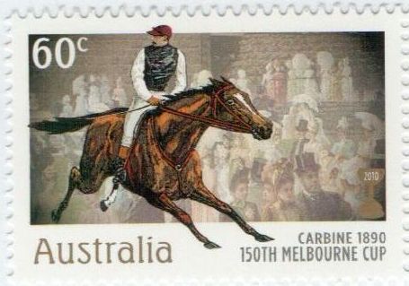
The thing I especially like about this set of stamps issued in 2010 on the 150th anniversary of the Melbourne Cup, is that the crowd shots in the background reflect the era of the respective champion horse. I think they are a very nice set of stamps.

Compare the above issue of 2010 to this 1978 release - which do you prefer?


I often prefer the retro-appeal of stamps from the 70s, but in this instance, I think  the more recent 2010 stamps win out for me. By a nose. (Boom boom).

And just to demonstrate that this country is completely nutso when it comes to horse racing (if you weren't already convinced) here is a third set of stamps dedicated to the "Champions of the Turf". It is my least favourite of the three issues and is from 2002. What do you think?


I have mixed feelings about horseracing, but boy do I love a public holiday! I also love horse names, and once lost $5 on "May the Horse be With You" because I thought it was possibly the best name EVER.

And with that (stamps - tick; topical subject matter relevant to the day- tick; borrowed Star Wars pun - tick) I am done. Night folks and thanks for stopping by!

Sunday, 16 September 2012

Island Airmail: Sunday Stamps


This Sunday I heart post comes to you direct from my Dad's study. I am home visiting  my parents, and also my sister who has just flown back to Australia after living in Sweden for the past couple of years. (Welcome home Elspeth!). So for this week's Sunday Stamps, I decided to flick through my Dad's collection of First Day Covers from when he was a boy, to find something suitable for the theme of 'the post'. Any regular readers of this blog would know that I am particularly fond of 'post' and choose to define it broadly.


Although I did not find any stamps with post boxes or stamps on them - I did find two covers celebrating airmail. The one above is from Western Samoa (which has now dropped the 'Western' from its name and is officially the Independent State of Samoa).


Also within Dad's collection I found another contemporaneous cover celebrating airmail from Papua and New Guinea, also issued in July 1970.


The stamps are very nice, with the planes flying over volcanoes (after my recent trip to Indonesia I am most definitely into volcanoes: almost to the point of starting a second blog called "I heart volcanoes"). But the other thing I like about the PNG cover is the stylised image of Australia and Papua and New Guinea linked by the plane. Pretty cool. 

I am seriously starting to wonder why I loved just plain old stamps all these years, when I could have been loving first day covers, which are stamps with the added bonus of designs on envelopes and fancy postmarks. Who knows why I was so slow to catch on, but the important thing is now my passion for post has enlarged to definitely include FDCs. And when airmail and volcanoes are involved, it is just the icing on top!


For other post related blogs this weekend, check out Viridian's Sunday Stamps through the button above. Happy Sunday!

Sunday, 24 June 2012

Geek is Chic: Sunday Stamps

Once again, when turning to a favourite set of stamps, I find myself drawn to an issue from the '70s. I know that words like "vintage" and "retro" are catch-cries of the hipster-generation, and as such are a little over-used at the moment. And lets face it, I mock hipsters, but I myself have, shall we say, "hipster tendencies," (if a pair of ray-bans count as a tendency). Anyhow, I digress. What I am trying to say is that I am more than happy to go with the retro-loving crowd on this one: 1970s design is wicked.

New word for the week: SPECTROPHOTOMETRY!
So. This classic set of stamps was released in May 1975 and celebrates Australian achievements in science. I don't know if science has ever looked so funky. 


This one makes me think of  the movie "The Day After Tomorrow"


Grandma Nellie kept the original packaging (thanks Grandma!), so I have the designer's notes for the release. The notes read:
The challenge was to convey the significant contributions made by Australia in certain scientific fields. faced with such unfamiliar subject matter, the limited language of graphic design proved inadequate, and it was necessary to resort to written explanations which then became major design elements.
These presented their own peculiar problems, since the words had to satisfy the scientists participating in the chosen fields, and at the same time satisfy the rigorous formal demands of space within each design.
 Well, I think it is safe to say that the designers nailed it. These stamps are brilliant. And I think all the hipsters would agree: Geek is Chic. Hooray for science nerds!